The slideshow above displays a comparison between the previous logo design before it was rebranded.
Olegs & Rita Photography
In 2016, I developed a custom logotype and logomark set for UK-based wedding and lifestyle portrait photographer, Olegs Samsonovs. 5 years on, my client got in touch with me again and we discussed his desire to rebrand with the incorporation of his partner, Rita, into the brand name as she is an integral part of the business.
Olegs wanted to keep the silhouette of the Mikoyan-Gurevich MiG-21 fighter jet from the previous design, which is in memory of his father who flew them as a test pilot, to provide the logo with a personal touch. However, the overall feel of the new logo design was to be more ‘earthy’ and ‘dreamy’ with ‘an accent on nature’.
"Rita and I are in love with our new logo and we have loads of compliments from other people! Thank you so much!!!"
— Olegs Samsonovs
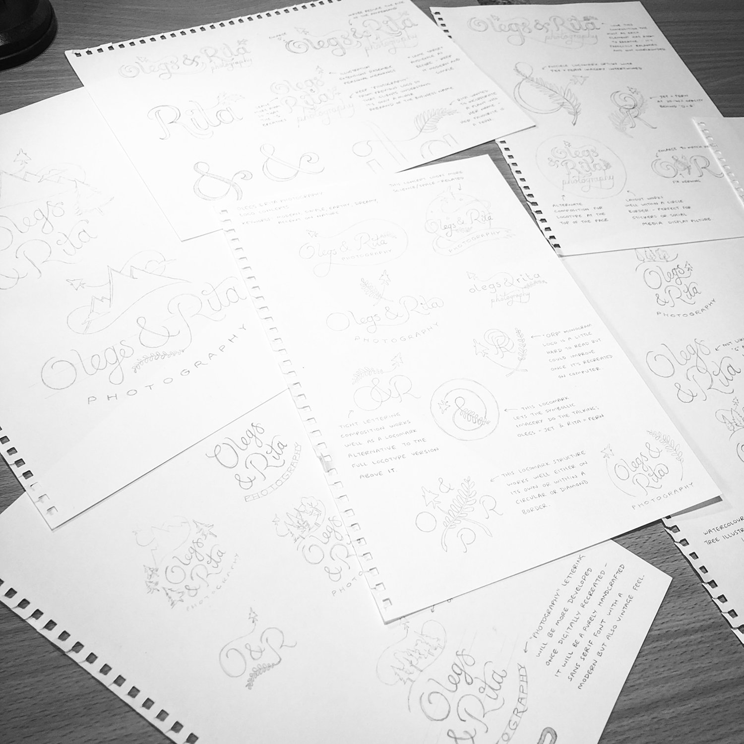
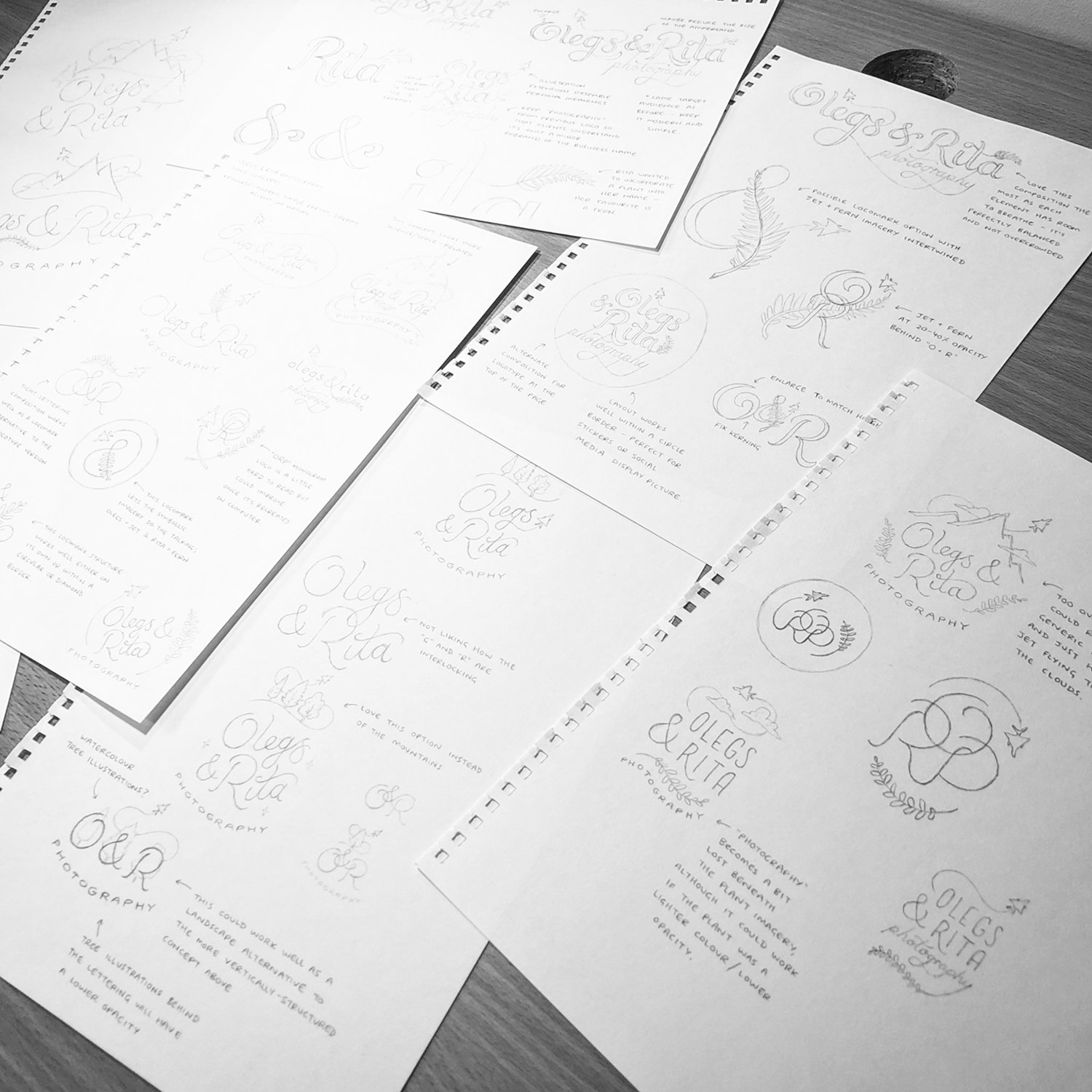
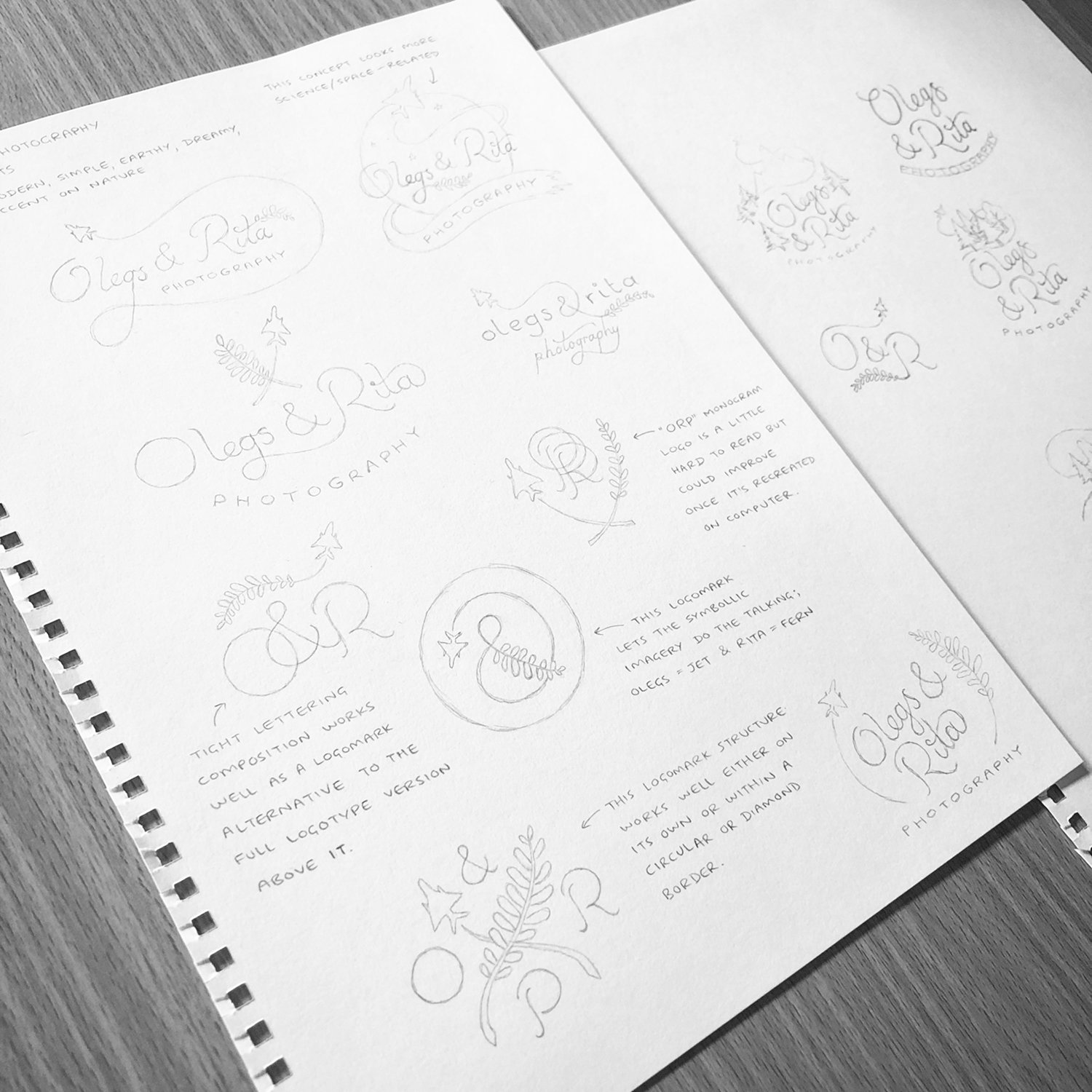
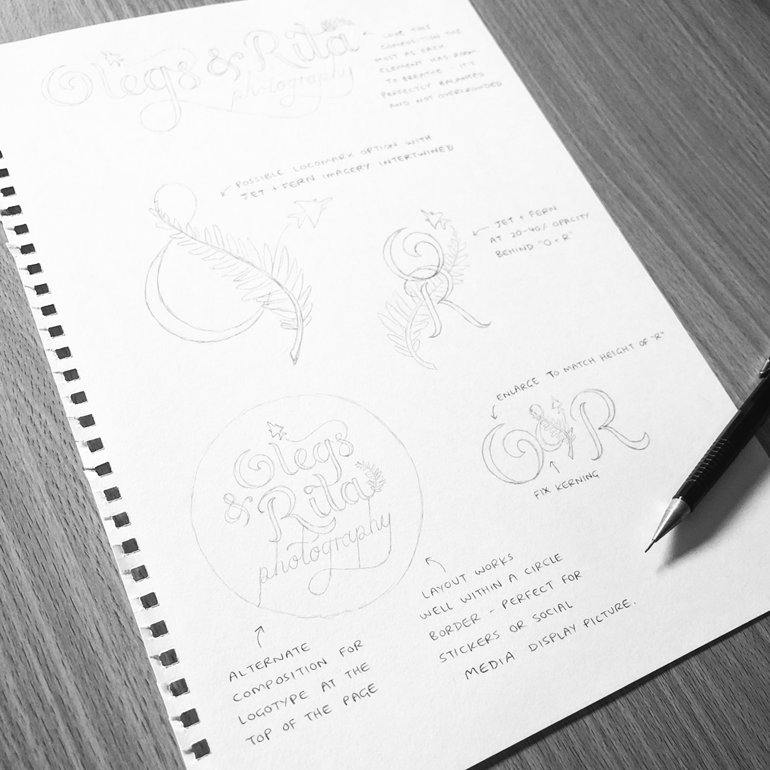
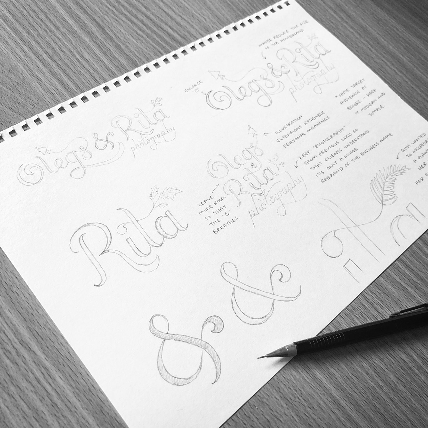
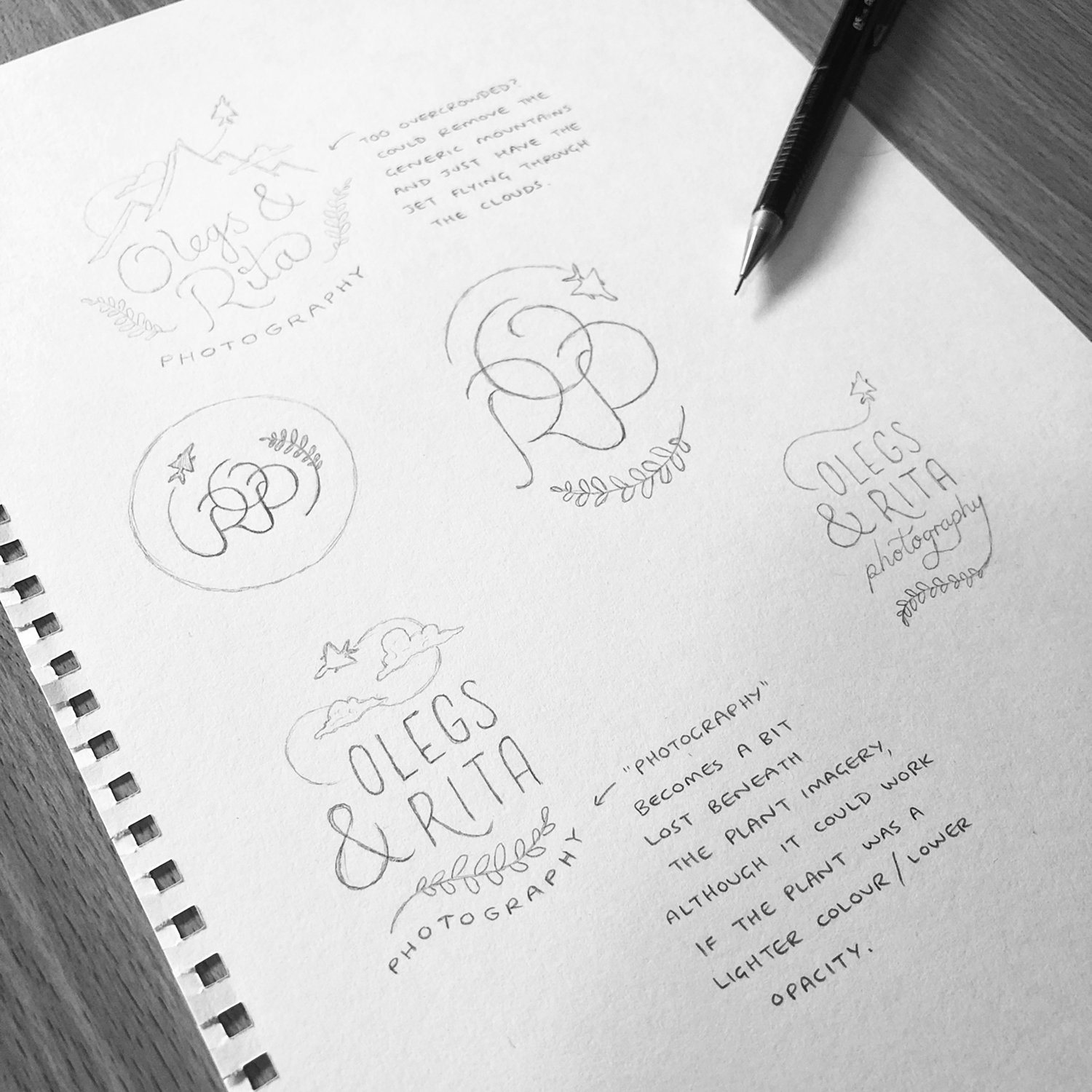
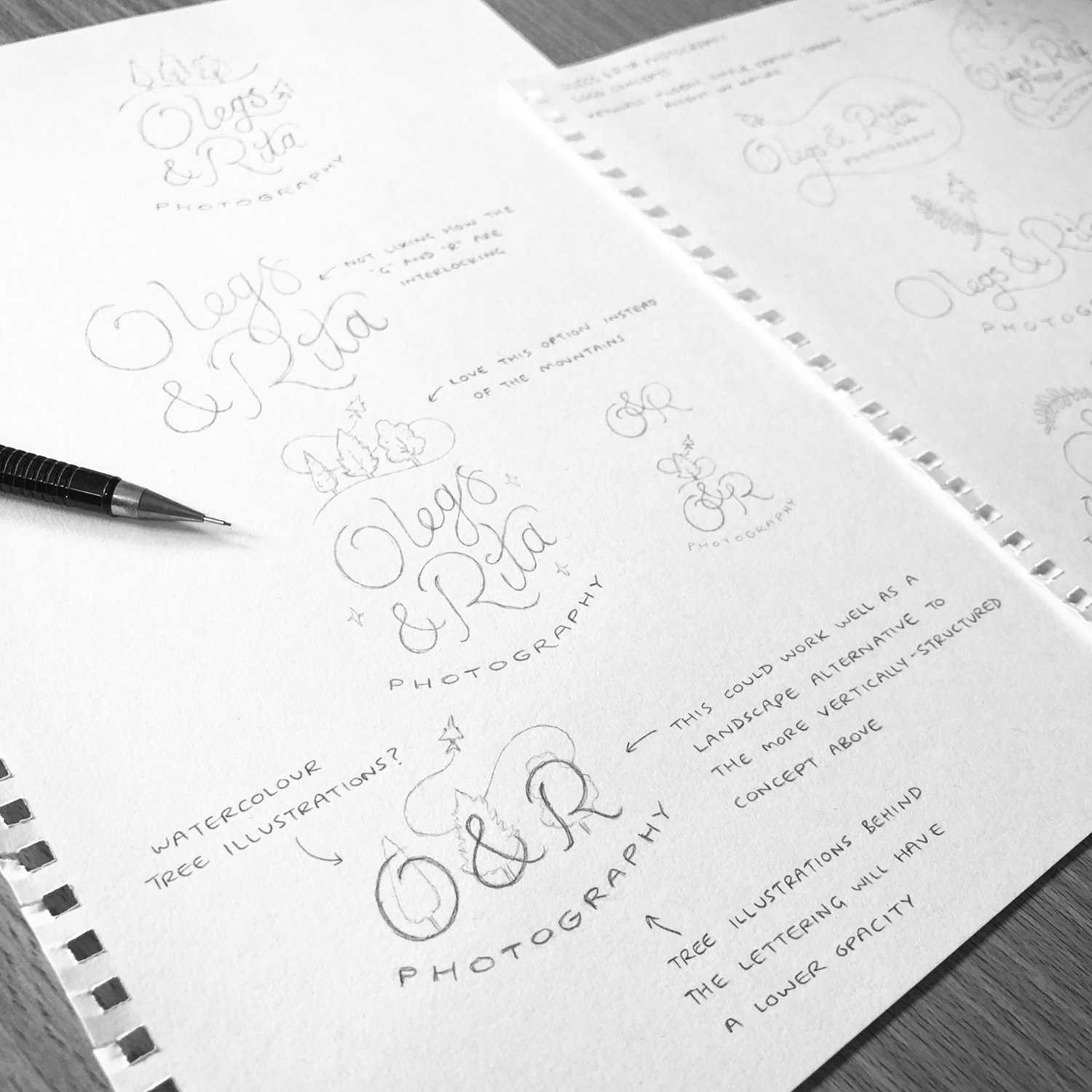
During the concept creation stage, I initially played around with the lettering style used in the old logo to maintain some familiarity within the rebranded design. However, my client felt the logo needed to be something ‘fresh and dreamy’, so I worked on several different styles and compositions; monogram options, more playful and free-flowing lettering, ampersand-focused designs etc.
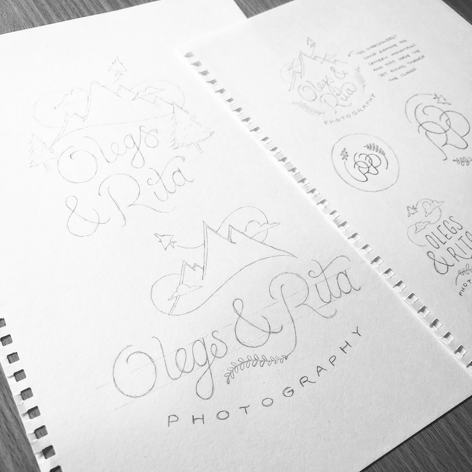
My client preferred the less structured options where the lettering wasn’t restricted to a grid, so I continued developing the concepts with a more free-form style. Eventually, I came up with an idea where the contrails of the jet formed the shape of an ‘S’ around the trees, which stands for my client’s surname, ‘Samsonovs’.
The custom logotype needed to be simple, modern and unique, whilst also containing several personal meanings within the design. The logo is to be applied on various forms of brand identity, on their website, and on the wooden gift boxes and USB sticks (pictured below) that get sent out to the newly married couples!

